The Golden Gate Bridge Was Almost Painted Black and Yellow
You might think the iconic Golden Gate Bridge has always been its distinctive shade of International Orange, but you'd be wrong. In fact, this San Francisco landmark nearly sported a striking black and yellow striped design, reminiscent of a giant bumble bee spanning the bay. The U.S. Navy proposed this eye-catching color scheme to improve visibility for ships traversing the foggy waters. However, architect Irving Morrow had other ideas. His decision to reject the Navy's proposal in favor of the now-famous orange hue would forever change the face of San Francisco's skyline and the bridge's place in popular culture. But what led to this pivotal decision?
Key Takeaways
- The U.S. Navy proposed painting the Golden Gate Bridge with black and yellow stripes for enhanced visibility.
- The proposal was backed by the War Department to prevent maritime accidents in foggy conditions.
- Architect Irving Morrow rejected the black and yellow design for aesthetic reasons.
- Morrow chose International Orange, balancing visibility with beauty and artistic value.
The Navy's Bumble Bee Proposal
You might be surprised to learn that the U. S. Navy once proposed painting the Golden Gate Bridge in black and yellow stripes, like a giant bumble bee. This unusual color scheme wasn’t just for show; it was designed to enhance visibility for maritime navigation in the often foggy conditions of San Francisco Bay. The Navy’s proposal, backed by the War Department, aimed to prevent maritime accidents in the busy waterway. Although the idea was intriguing, it faced significant public opposition, as many residents and local artists felt it would detract from the iconic beauty of the bridge. Interestingly, this debate over color parallels how ancient sculptures originally painted colors have often been overlooked; many artworks we admire today were once vibrant and detailed, rather than the stark white marble we commonly see. Ultimately, the Navy’s proposal was never realized, and the bridge remains a testament to both engineering brilliance and the aesthetic values of the city. The controversy surrounding the bridge’s color scheme reflects a broader theme about the intersection of functionality and aesthetics in urban design. Just as the proposed colors for the Golden Gate Bridge were meant to enhance safety, choices in historical art and architecture often aimed to convey power and prestige, such as the history of purple dye in royalty, which was highly prized and reserved for nobility. In the end, the Golden Gate Bridge not only stands as an engineering marvel but also a symbol of the cultural values and priorities of its time, reflecting how artistic choices can evoke strong emotions and social commentary.
However, architect Irving Morrow had a different vision. He rejected the bumble bee design in favor of International Orange, citing its aesthetic appeal and better harmony with the surrounding landscape.

Morrow's decision ultimately shaped the bridge's iconic status. While the Navy's concern for safety was valid, the choice of International Orange proved to be a perfect balance between visibility and beauty, cementing the bridge's place as a recognizable landmark.

Morrow's Visionary Color Choice
In the face of conventional wisdom, Irving Morrow's bold choice of International Orange for the Golden Gate Bridge set it apart from other structures and paved the way for its iconic status. You might wonder how this visionary color choice came to be. Morrow discovered a reddish-orange primer during construction, which inspired him to break from traditional bridge colors. He recognized that International Orange would enhance visibility for maritime navigation in San Francisco's foggy conditions while offering a unique aesthetic.
To convince the Department of War, Morrow emphasized the color's artistic value. His persistence paid off, resulting in a bridge that's now synonymous with San Francisco.
| Aspect | Before | After |
|---|---|---|
| Color | Navy's black-yellow | International Orange |
| Visibility | Standard | Enhanced |
| Aesthetic | Conventional | Unique |
| Safety | Typical | Improved |
| Status | Ordinary | Iconic |
Impact of International Orange

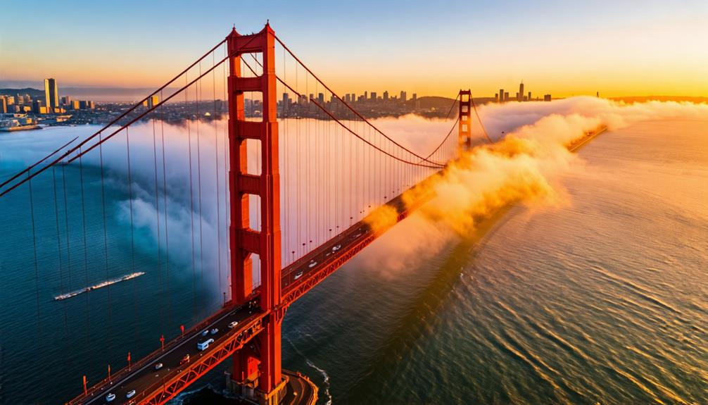
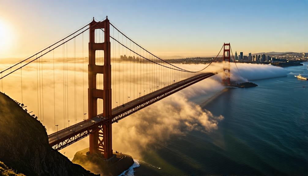
Morrow's visionary choice of International Orange for the Golden Gate Bridge had far-reaching consequences beyond its initial aesthetic appeal. You'll notice how this vibrant hue enhances visibility in the region's frequent fog, contrasting beautifully with the surrounding environment of blue waters and green hills. The color's formula, with specific CMYK values, guarantees a distinct appearance that contributes to the bridge's iconic status worldwide.

International Orange isn't just about looks; it also addresses essential safety considerations for maritime navigation in the busy San Francisco Bay. By rejecting the Navy's proposal for black and yellow stripes, Morrow created a landmark that's both visually striking and practical.
The color's ability to stand out in various conditions has made the Golden Gate Bridge instantly recognizable, cementing its place as a global icon and proving that sometimes, the boldest choices have the most lasting impact.

Conclusion
You've learned how the Golden Gate Bridge narrowly escaped becoming a giant bumble bee. Instead of black and yellow stripes, you now see a majestic structure in International Orange.
It's not just a bridge; it's a symbol of artistic vision triumphing over practicality.
Next time you're in San Francisco, you'll appreciate how this bold color choice has made the bridge an enduring icon, standing out against the fog and capturing hearts worldwide.


